Artifact |
Designs Using Advanced Editing Techniques of Adobe Software The artifacts displayed below highlight general design competencies and pedagogical considerations in developing artwork and graphics for instructional purposes. These artifacts are also meant to demonstrate skills in using advanced editing techniques of various Adobe Software. Some of artifacts are optimized for web-based delivery and others are more suited for print. Please view the Creative Commons details below for copyright information.
|
|
|---|---|---|
|
This melon was designed by a hand drawing which was scanned then regular contours, shapes and colors were added to enhance the artwork. The feather tool in Adobe Fireworks was used extensively to create the blurred appearance of the red and white portion of the artwork. I plan to use this piece of work in a digital story for elementary school students. |
|
|
The soccer ball was designed for a sample lesson that includes teachers and trainers. The work was for a visual designed to review the "Contiguity Principle" of multimedia. The visual is designed with considerations for learners focusing on creating metal models in "routine" operational tasks referred to as "near transfer tasks." Therefore the level of detail should not significantly influence cognitive load during the learning task. The light and shadow effects were achieved using feathering, blurring and the incorporation of the gradient feature of Adobe Fireworks. |
|
|
This drawing was done using the pen tool in Adobe illustrator My motivation for creating this visual was to remind trainers and teachers to consider all learners when depicting images of people. I will use this creation in a mini-lesson about cultural diversity. I used a "line-art" approach to reduce the probability of cognitive overload because of the complex theme I will be addressing. The lack of detail, color and shading are therefore deliberate and ideal for the project being considered. |
|
|
I decided to use a fruit to describe tones, discuss, color, shade, focal point, and other design considerations. I thought it would be very different from using other objects to delving directly into CRAP (Contrast, Repetition, Alignment, Proximity). I would use this exercise as a precursor to topics on effective web design. The idea of using a familiar item, which is non-imposing should minimize anxiety associated with learning unfamiliar topics. Some of the cautionary notes are that fruits can stimulate the wrong kind of prior knowledge and distract learners who enjoy eating fruits or those who are hungry! |
|
|
In developing this artifact considerations were given to opportunities for and interpretations by young learners. While the pumpkin does represent a halloween theme it is meant to be used in a much more dynamic way. In addition to lessons dedicated to the traditional holiday approach there is an opportunity to discuss color, shapes, lines, texture, taste, weight, size and procedures. The graphic is in a jpg format and suited for print. However the dimensions, use of solid colors and limitations in the number of colors used also makes it ideal for online projects. |
|
|
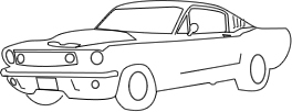
The pen tool was used to design this car. I plan to use cars as a theme to engage young readers about safety. I have considered the age of the students and chosen to do an outline rather than color the image. The portrayal of the car does however include fine details and in using it with young learners there is the potential of distracting some learners. |
 |
|
While I am more of a soccer fan I will admit that Boise State University has inspired me to design this football because of its great college team. I plan to use this image with middle school and elementary school students as clip-art. I used both the pen tool as well as shape tools with punch and combining features. |
|
|
This image was used in my kindergarten math counting workbook series. I used Adobe Illustrator to develop the artwork for print at 600 dpi's. The artwork features a black outline with two a color variation. Color choices helped in veiwer identification of the object as well as reduce the realism for young learners. |
|
|
This image was also used in my kindergarten math counting workbook series. Again, I used Adobe Illustrator to develop the artwork for print at 600 dpi's. A white outline was used to distinguish between different parts of the creation. The gradient tool was used extensively throughout the design. |
|
|
My plan is to use this image to engage young learners in a dialogue about counting, colors, and shapes. In this little "game" students will help Polly to count the number of blocks or the number of a specific color of blocks. Learners may also count blocks that are solid or have primary and secondary colors. I used a static image with an outline to help young learners focus on the task. |  |
|
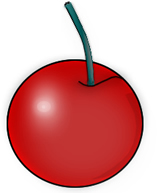
I have used this cherry in an attention visual for grade K students. The details of the image are distinct. Therefore I reduced the transparency value in Fireworks to 75% of the original and reduced the size of the image so it would remain appealing but did not serve as a distractor from the objective of the counting lesson. |
|
|
|
|